As the submissions continue to flood in for FilmDoo’s creativity competition, the team at FilmDoo have decided to take a look at some of their favourite entries so far. In doing so, we’ll not just be looking at those we have chosen, but also comparing them to their originals in order to celebrate the recently established partnership between Shooting People and FilmDoo!
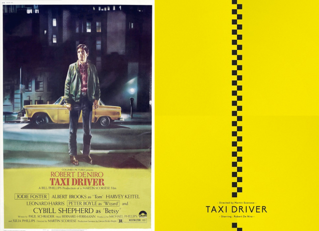
Our first choice, with a decidedly Shooting People colour scheme, comes courtesy of Belgium’s Maxime Damo, whose simple yet stylish approach to Martin Scorcese’s Taxi Driver (1976) created an excitable buzz in the FilmDoo office. Considering the undisputed stature Taxi Driver holds in cinematic history, Maxime has chosen an understated approach to his take. Instead of using the iconic image of Travis Bickle (Robert De Niro) remonstrating with himself in the mirror or stomping the streets of New York, Maxime’s tapered approach is highly original. Obviously, the strip down the middle of Maxime’s poster eludes to the pattern that has become emblematic of New York city’s taxis yet it also evokes imagery of a zip; as if behind this poster lies the cinematic tour de force that cinephiles have come to know.
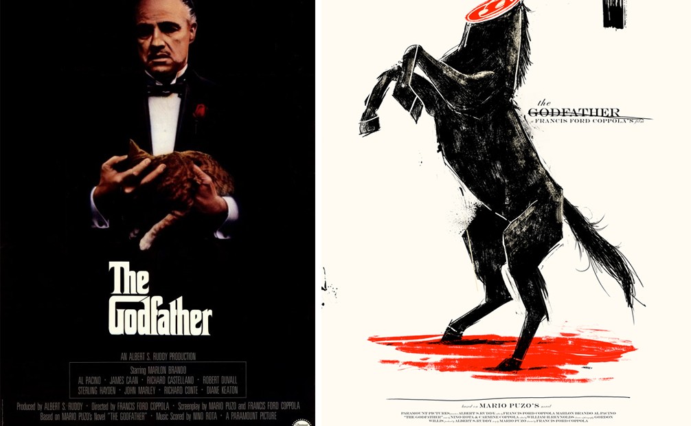
Secondly, the team at FilmDoo went for another of cinema’s greatest films, Francis Ford Coppola’s The Godfather. Just as the aforementioned original poster features its main protagonist as the main focal point, so does the original for The Godfather, as can be seen below.
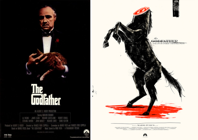
Visually striking, Canada’s Marie Bergeron’s adaptation of The Godfather’s poster differs greatly from the original. Undoubtedly, Marlon Brando had the power to dominate both the moving image as well as the still, yet Bergeron’s take on the poster takes us right into the heart of the film itself. The original highlights the wealth, sophistication and occasional sincerity of Vito Corleone (Marlon Brando), while Bergeron’s poster takes a different approach. By referencing a particular scene from The Godfather, Marie contradicts the themes evident in the original. The beheaded stallion comes to symbolise the depraved lengths at which the Corleone family were willing to go to cement their family’s standing and obtain whatever it was they desired. One of our team was reminded of the Ferrari logo meeting a sticky end.
Having chosen two entries based on films of old, the team at FilmDoo felt it necessary to further detail our enthusiasm with the entries so far by choosing a more contemporary film. Step forth Sara Suttle from the USA, whose almost surrealist take on Blue is the Warmest Colour thoroughly delighted the FilmDoo team.
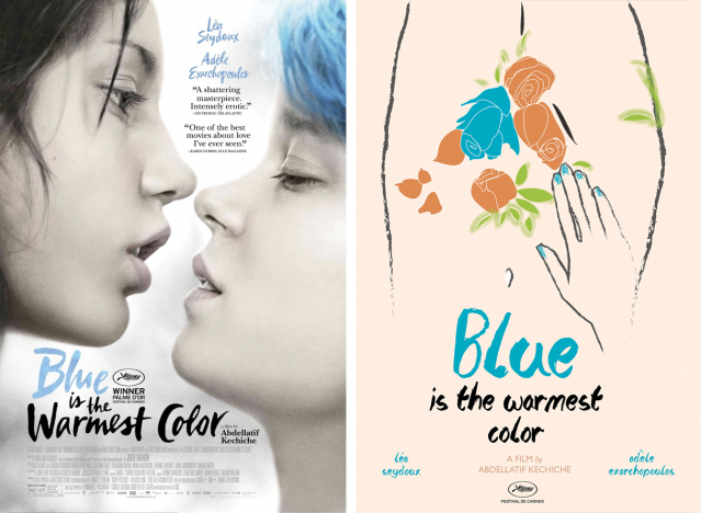
Released in 2013, Abdellatif Kechiche’s female focused erotic drama had the majority of its audiences in raptures at its mature handling of sexual themes, and Suttle’s entry perfectly exemplifies the same sense of intrigue, the hand seemingly reaching out towards sensations both emotionally and sexually-charged, here depicted by flowers, in the same tentative and curious manner embodied within the actual film. The broad, tapered brush strokes, meanwhile, reminded us of Isao Takahata’s The Tale of Princess Kaguya.

Next up we have another of our current favourites, courtesy of the Philippines’ Kirk Dijamco and his submission for the darling of the Oscars, Birdman.
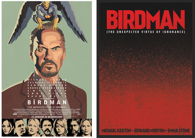
Perhaps the most interesting aspect of this poster is its usage of a comic book-esque type of colouring, which reminded us of 30 Days of Night and V For Vendetta. Although Birdman was in fact not adapted from a comic book, the superhero in Birdman is depicted, aesthetically, in the same light as other superheroes that have been brought to the screen when once they only resided in the pages of comics. In doing so, Dijamico has managed to infuse an entirely new theme into his poster. Could we see Birdman begin life as one of the world’s new superheroes? Maybe.
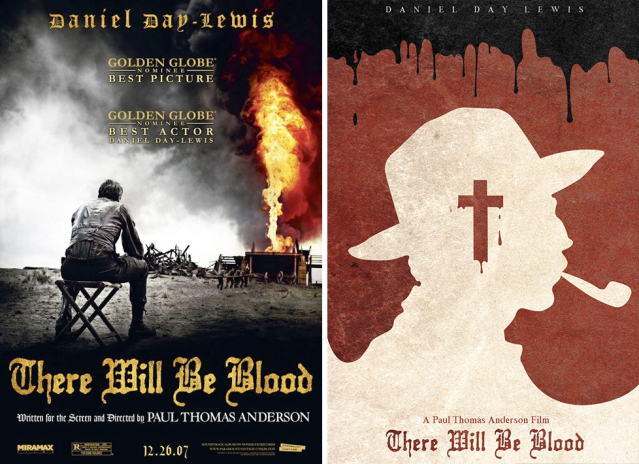
Our fifth and final poster to fall under the filmDoo spotlight comes courtesy of the UK’s very own Jared Roshi’s reinterpretation of Paul Thomas Anderson’s There will Be Blood. Amidst themes of religion, greed and murder, Roshi chooses to paint the silhouette of Daniel Plainview (Daniel Day- Lewis) against a blood-spattered backdrop whilst the cross of Christ hangs ominously over the spectre of Plainview. Whilst both the original poster and this entry choose to mask the identity of the film’s main protagonist, Roshi’s cleverly highlights a notion not only personal to the film, but also a theme that has wider cultural significance; oil money is in fact tainted by the blood of those ruthless enough to hunt its wealth.
So far FilmDoo has received over 400 entries for the competition, and there are many more favourites we’ll be revealing to you in due course. But in the mean time, head on over to the competition page to check out the prizes and jury panel. If you have an eye for movie poster art, or know somebody who does, get involved!


